So after my rave review of the ColourPop shadows and a few friendly recommendations, I decided to show off a couple of eye looks using my latest favorites.
Here are the swatches from my original post to use as a reference for what the shades look like on their own. For this post, I won’t be going in the numerical order listed here though.
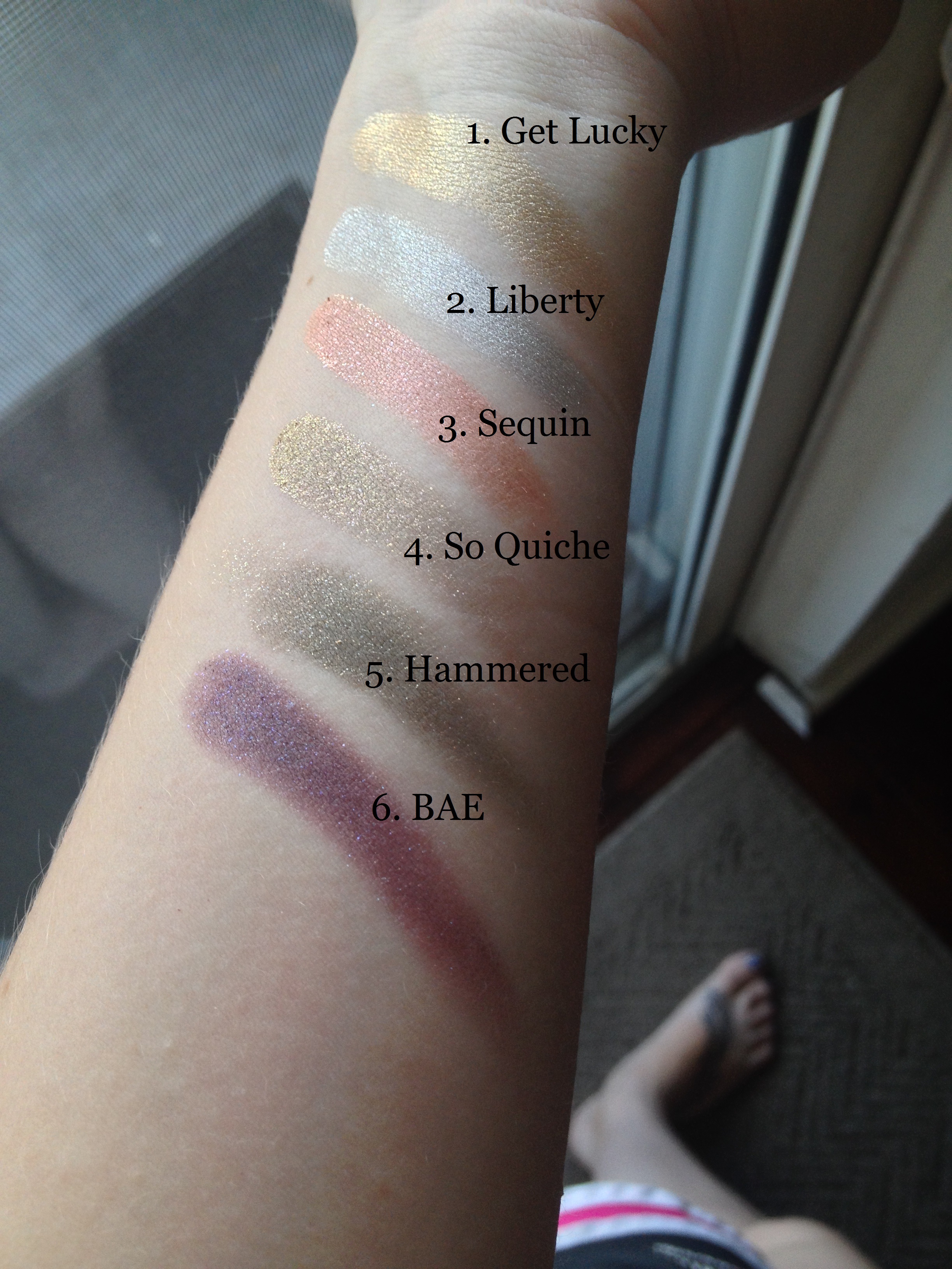
Swatches
1. Get Lucky
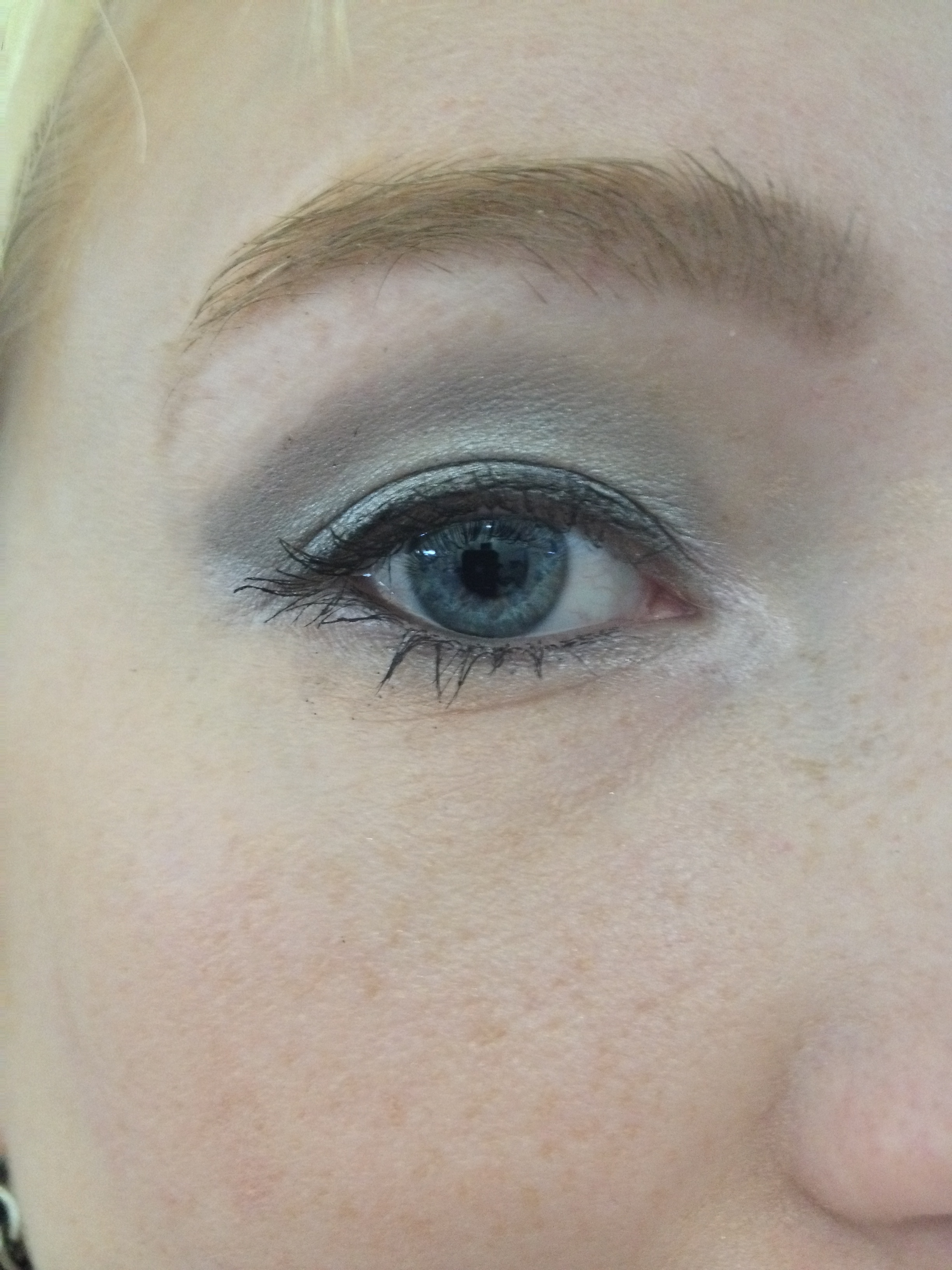
As I mentioned in my original post, my go-to look with is a warm brown shade in the crease (usually, NYX’s Velvet) and then packing the ColourPop shade all over the lid. I’ve done this with all the colors I own, and it always looks good. A very simple eye look: two minutes tops and you’re ready to roll. The shade I use the most for this look is the metallic gold, Get Lucky.
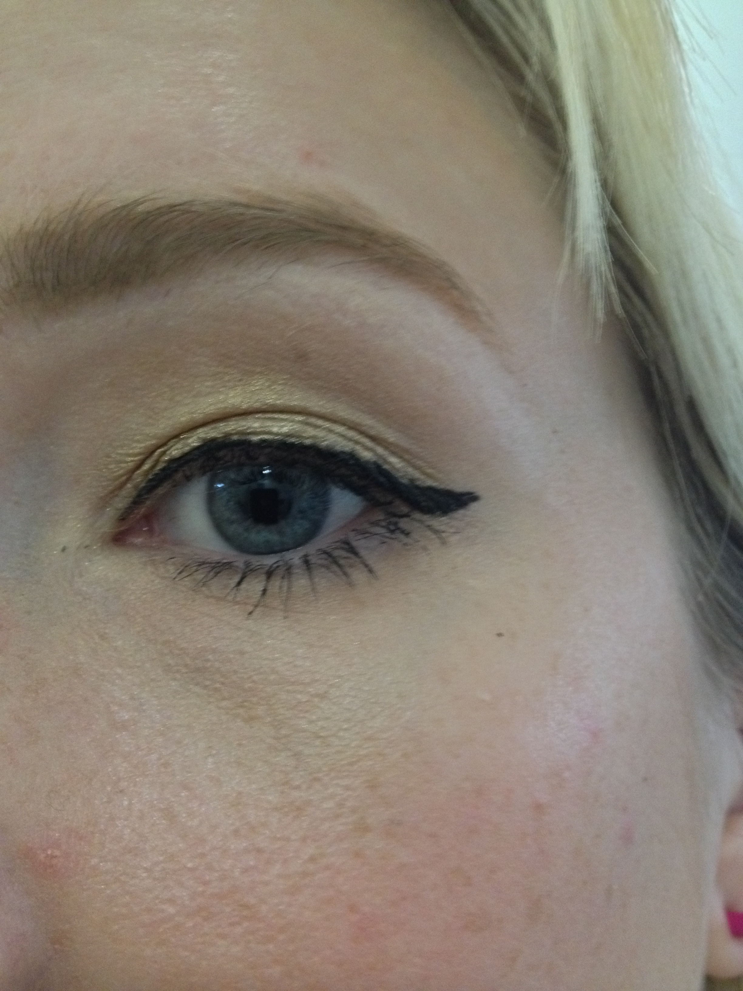
Perfect for day or evening.
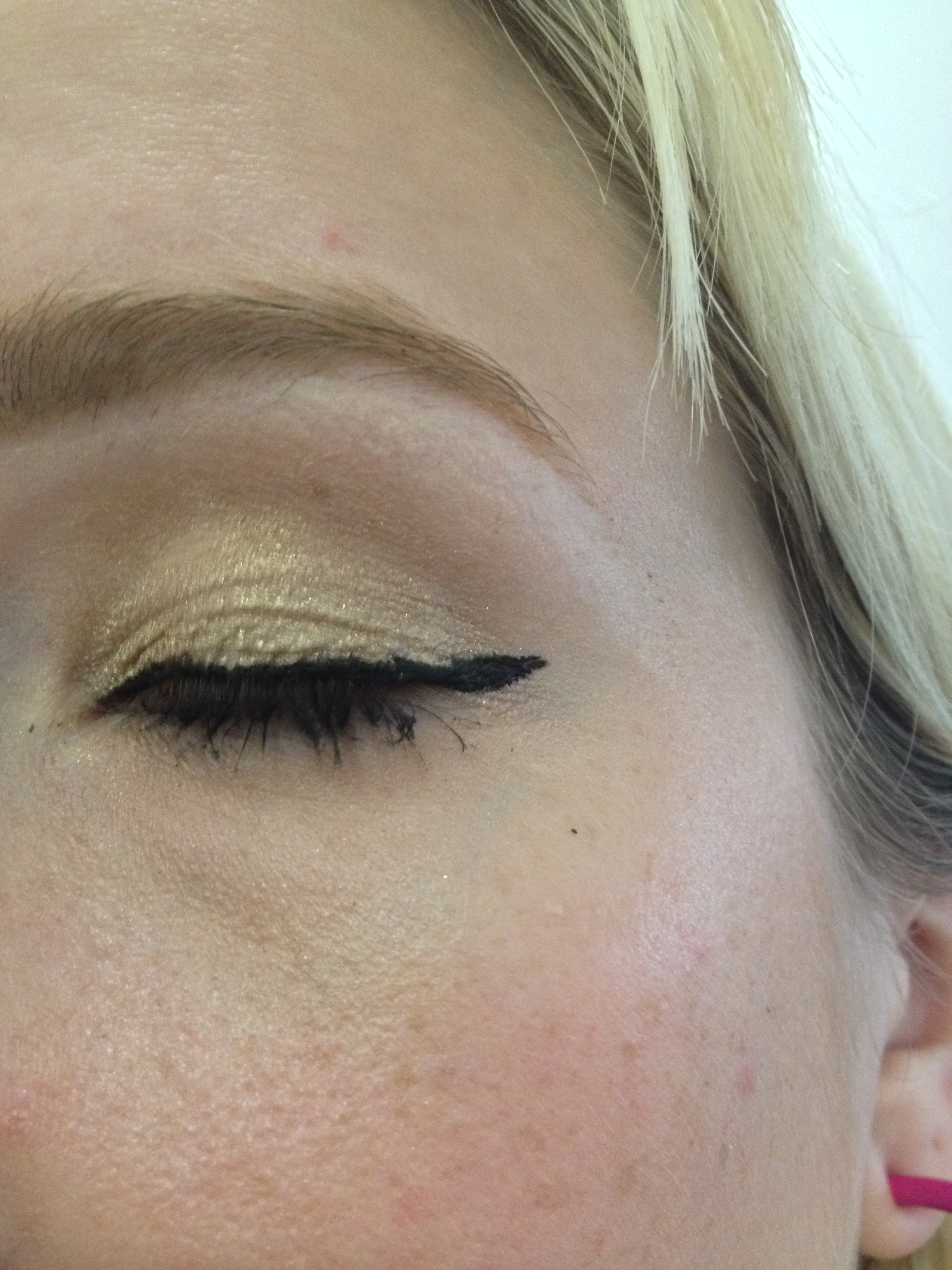
Gotta work on my wing skills, this is a bit wonky.
Truly going day-to-night with your makeup can be a challenge. But I think the above look could transition well, maybe without the winged liner if your work environment was more traditional. The gold is metallic, but can be soft and subtle depending on how you apply it.
2. Hammered

A much darker look.
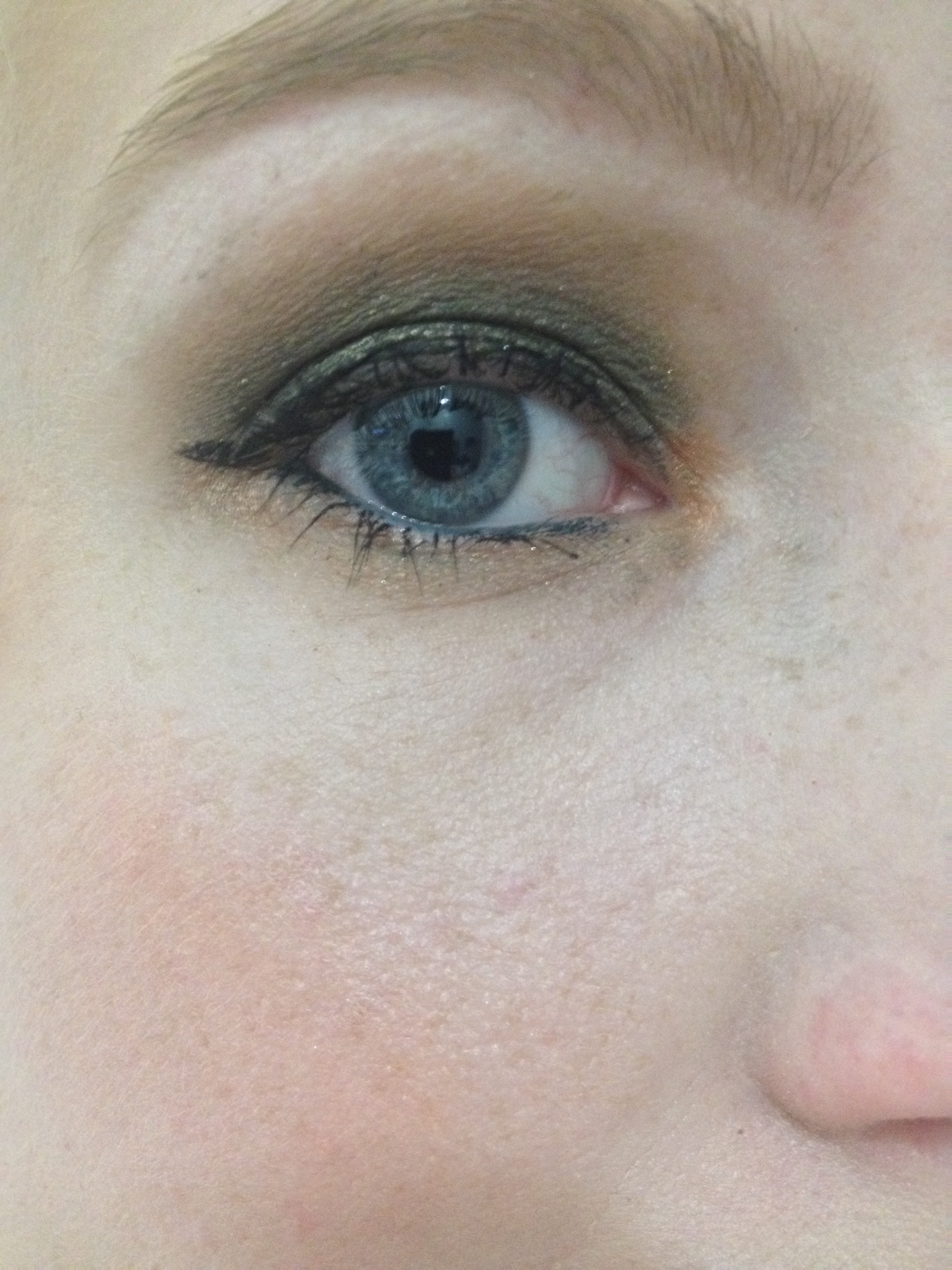
An all over green smoked lid.
Once again, NYX’s Velvet is in the crease. I used a Maybelline Color Tattoo from their limited edition leather line in Deep Forest as a base, to darken the look up. Then I packed ColourPop’s Hammered all over the lid as well. I also ran a shimmery copper shade underneath my lower lashes, which turned out well.
Hammered by itself is really pretty and more of an olive with golden shimmer, so I wanted to try something a little different with it. These ColourPop shadows layer really well, especially with the Color Tattoos.
3. Sequin
For this next look, I used Sequin and the Kat Von D Poetica palette.
I don’t normally go this bold with my eye looks but the darkest shade got a little out of control, so I just went for it. For me, Sequin is one of my more versatile colors because I like warm orange/copper tones for my fair skin and blue eyes to really stand out.
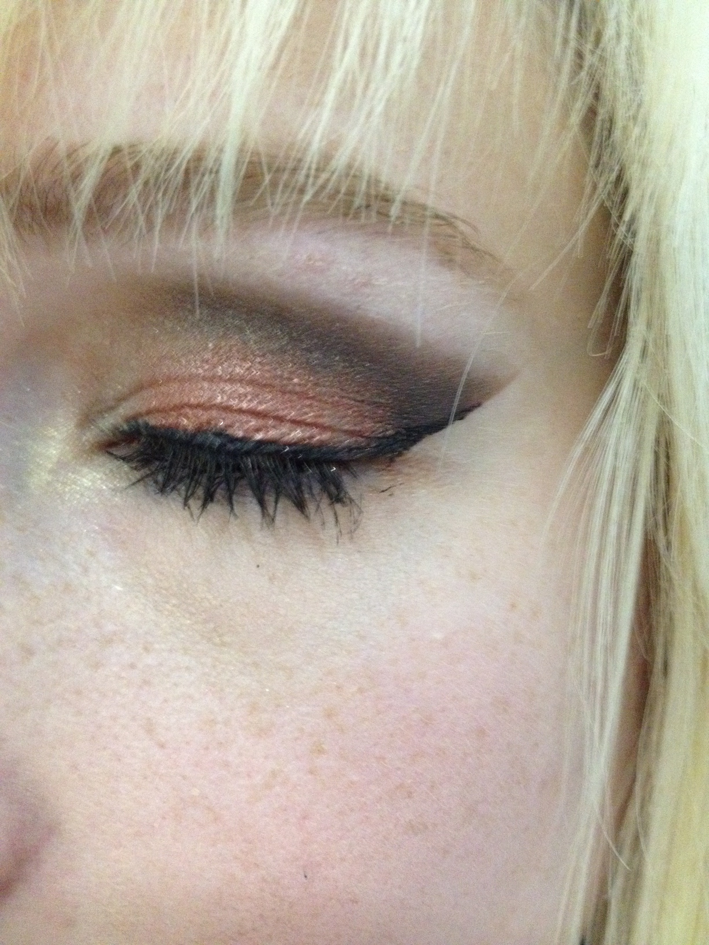
Easily one of the boldest looks I’ve ever pulled together.

4. So Quiche
For this next look, I used So Quiche on 2/3 of my lid over a nude base. I gently blended a shade that I’m calling a Fool’s Gold from last year’s Coastal Scents Fall Palette along the outer corner and into the crease. I also ran So Quiche under my lower lash line to create a subtle smokey effect.
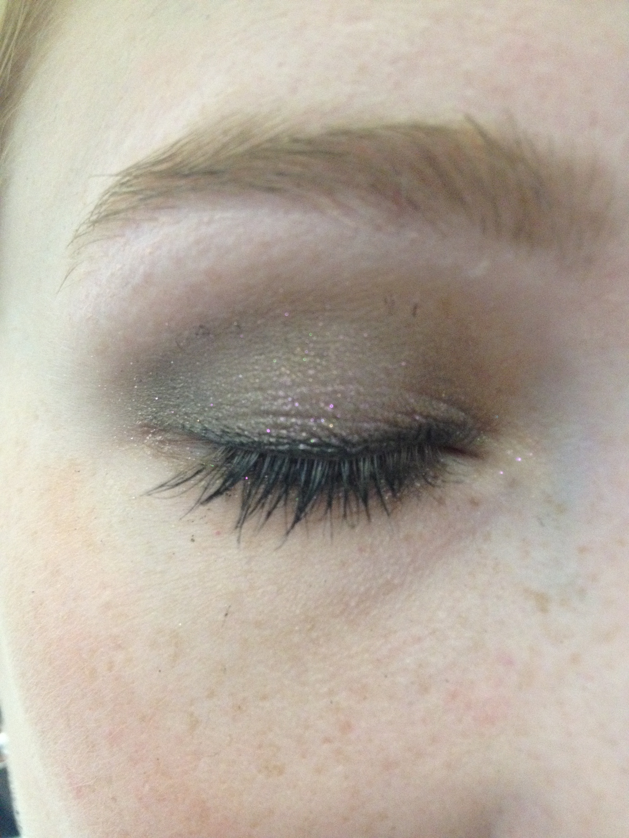
More on the subtle side.
5. Liberty
This next look features ColourPop’s Liberty, which is one of their super shock shades. I also used L’Oreal’s 24hr Infallible Eye Shadow in Sultry Smoke. I love using Sultry Smoke in the crease for silver toned eye looks; the blue-ish purple tone to the gray gives any look some added dimension.
Love that silver.

I really loved how this one turned out. I feel like an ice queen.
6. BAE
Love the color, hate the name. Last, but not least is ColourPop’s BAE, which looks blue in the pan but pulls very purple on the lid. There is definitely blue microshimmer in this shadow though.

Purple is a beautiful color on the lid but it can look like a black eye if you’re not careful. So it’s important to include different shades or tones in a purple eye look. I added NYX’s Velvet in the crease and NYX’s Jumbo Eye Pencil in Lavender along the inner corner and under the eye. I also used Sephora’s Jumbo Liner in purple to line the upper lash line.
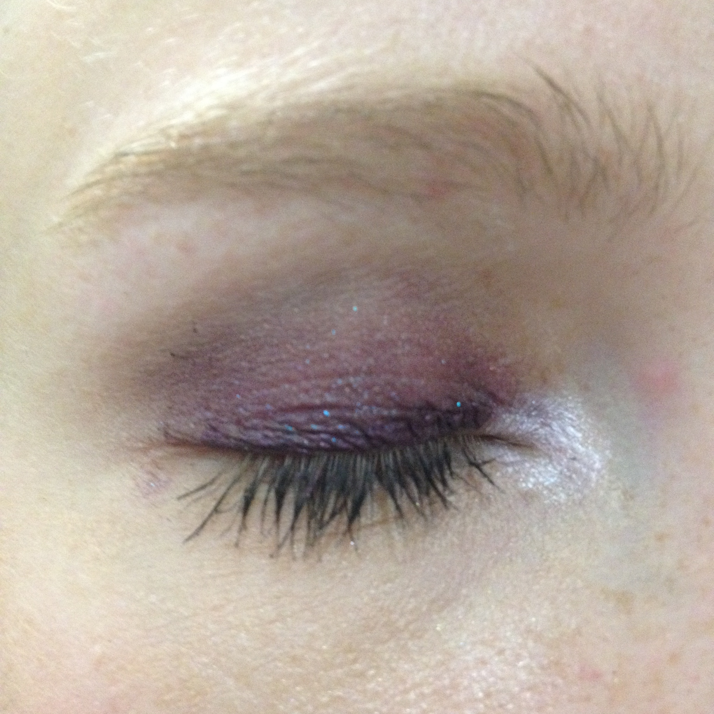
You can see the blue microshimmer better in this shot. Of all of the ColourPop shades I own, BAE is the least versatile, but when you find the right look for it, it’s a very pretty shade.
So those are a few different ways you can use ColourPop shadows. I’m constantly playing with them and figuring out new ways to wear them.
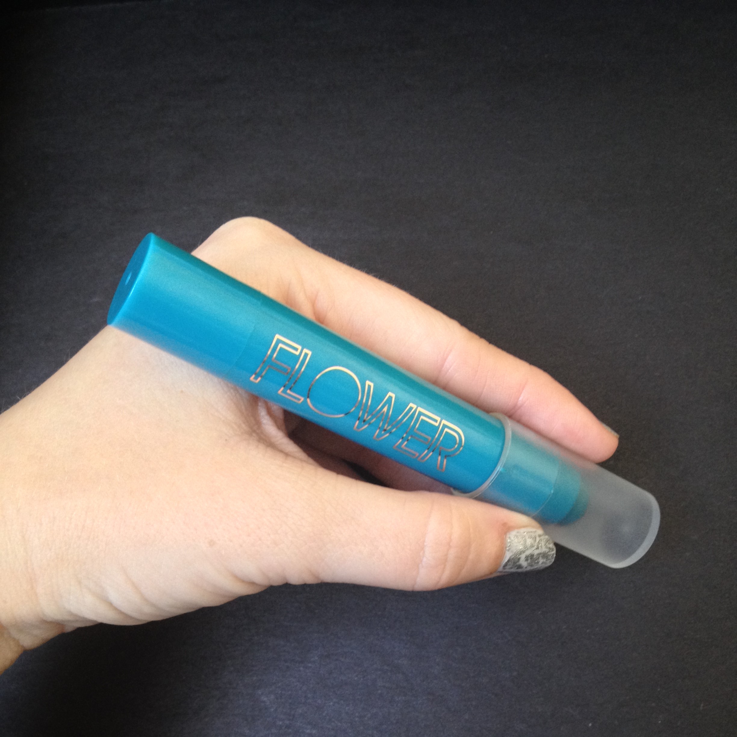
Each ColourPop shadow retails for $5, so they’re incredibly affordable. These shadows are also made in the US and are cruelty-free.
After the new year, I’ll probably revisit the brand since I have my eye on some of their holiday shades. Let me know in the comments if that’s something you’d be interested in seeing.
Thanks for popping in!