This week’s Broke and the Bookish meme is about the top ten cover trends that I love and/or hate. So for my Top Ten Tuesday post I’m going to talk about the top five cover trends I adore and the top five cover trends I wish would go away. Cover art is so important when it comes to selling books. Shelf appeal can make or break my wallet when wandering around Barnes and Noble. A good cover can snag my attention, while a bad cover can make me pass by a potentially brilliant read.
*As usual all the lovely pictures were respectfully borrowed from Goodreads.com*
Eye Catching Covers
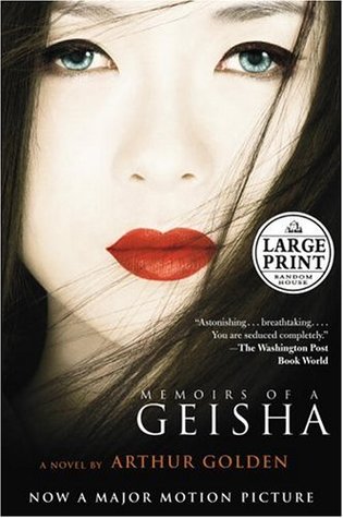

1. Movie Covers. You’ll notice this item appears twice on my list for two very different reasons. When movie covers are done well, they’re stunning. My favorites are the ones that don’t immediately clue you in to the fact that it’s a movie cover. I think what I mean by this is that the good movie covers don’t look like movie posters. They’re tie-ins, but don’t dominate the book’s identity. These two covers are striking but don’t feel like they’re trying to over sell the movie. So when a movie cover strikes that balance of tying in to the film without dominating the book, I’m all for it.
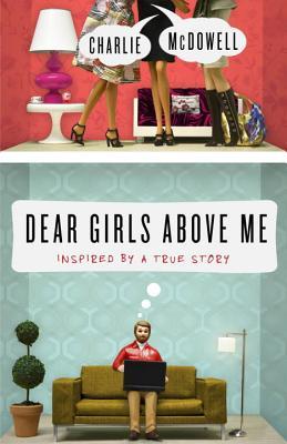

2. Toy Vignettes. This may be a weirdly specific cover trend but it always catches my eye and makes me want to read the back jacket. I didn’t quite know how to label this cover style, but I love it when these old school style dolls/toys get used in a creative manner. It’s just different enough that it really stands out.


3. Fancy bound, gilded, raised glories. Who doesn’t love these kinds of books? These two are from Barnes & Noble’s collection, and I realize they’re kind of pricey but I love books with the gilded edges and embossed details. They’re beautiful and right now they’re relegated to classics only because publisher want to have proven numbers before they put something this hefty on the market. I wish it were a bit more commonplace though. If they released Harry Potter with these gorgeous embossed, gilded, leather-bound editions I would shell out for sure.

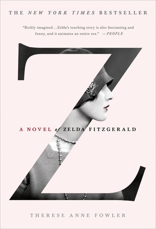
4. Black and White Photography. Original black and white photography covers are so stunning. They feel like a piece of modern art on your book cover. Richard Siken’s Crush (above, left) is not only one of my favorite poetry collections but it is maybe one of my favorite covers because it is so evocative of what you’re getting into when you read his work. I haven’t read Zelda yet but the cover is quite pretty. I think it’s also key that the shots are original. Though I don’t mention it below in my bad cover trends, using pieces of classic art sometimes feels like a cop-out and doesn’t tell me anything about the book’s content. So I enjoy the originality as much as the graphic nature.
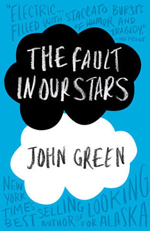
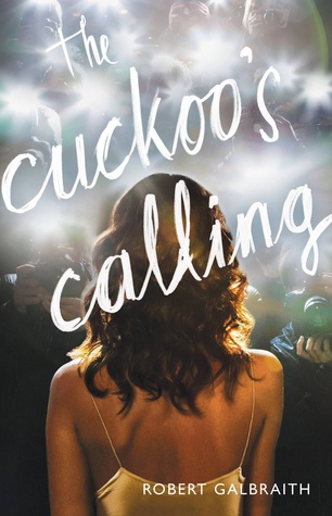
5. Blatantly Unusual Typeface. With a bundle of standard looking typefaces gracing covers left and right, I’m really enjoying the trend of having script or type that looks like handwriting. There are other kinds of unusual typefaces that I also gravitate toward. I think it’s just a matter of looking different from other books. And the pseudo handwriting also adds the illusion of a personal touch. Even if it’s an illusion, I like that element. Though I haven’t had a chance to read The Fault in Our Stars, this cover is lovely. The graphic clouds and the chalk-like script is an excellent combo.
Eye Sore Cover Art


1. Movie Covers. The two covers above illustrate what I was talking about earlier about movie covers just using the existing movie poster rather than trying to do something new. There’s nothing here to enhance the book experience it’s just a blatant ploy for the movie. It doesn’t help that these two specific books had really iconic covers to begin with. And if the movie bombs then the movie-book cover discourages readers. So clearly movie covers for books are a bit of a double-edged sword.

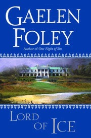
2. Vague Design. And yes, I realize my description is a little vague. But these covers tell me nothing. Sahara is an action adventure with twists and turns. Its cover is a sand dune, which while accurate to the location of the book is utterly boring. Lord of Ice is one of Gaelen Foley’s best historical romance novels, but this cover doesn’t hint at any of the intrigue, sensuality, and drama of her book. It’s a palatial estate, which again is the location but doesn’t help me with enticement as a reader. Locations aren’t enough. They usually end up being incredibly nondescript, which is vague design.
3. Mismatched Humanity. Nothing will piss me off faster than when the people on the cover of the book do not match the character description. DID SOMEONE AT THE PUBLISHING HOUSE NOT READ THE BOOK? We live in the era of Photoshop, people. If the model doesn’t specifically match in eye color or hair then it’s a quick freaking fix. I feel like the worst offenders are romance novels in this regard. What’s truly horrifying is when a book cover features a white woman or man when the main character is supposed to be a person of color. And I can tell you it has happened. Bad publishing houses! Bad!


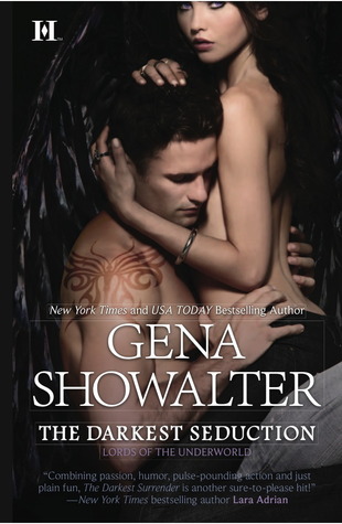
4. Torsos. In order to avoid number three on this list, I feel as though plenty of publishers just use faceless torsos to hawk their books. I find it very weird and uncomfortable. I get that usually these are romance novels and that sex is involved, but you’re making a person faceless and are only validating their bodies. It’s literal dismemberment. Above and beyond my qualms about personhood, you see so many faceless torsos on bookshelves that they’re kind of ubiquitous. They just don’t stand out or grab any one’s attention because half the cover out there have headless, ripped humans.


5. Flowers. Oh, is it a book for women? Let’s slap a flower on it and call it a day! I’d say at least a quarter of the bookstore looks like an ode to horticulture. Romance novels are prone to this but so is anything remotely in the realm of chick lit. This edition of The Scarlet Letter makes little sense to me. The flower isn’t even red. I blame New Moon: that bloody white rose on a black background was striking and kind of inventive. Now flowers are way overdone. And I do not care if flowers are supposed to evoke vaginas and female sexuality. Putting a blooming rose or orchid on the cover tells me nothing about the book. If I wanted to ogle some flowers, I’d go to a garden.
So those are my loves and loathes about cover art in modern literature. What are your best finds and worst offenders from this list?

I love your list, particularly agree with your dislike of vague images and torsos and when the people don’t match the characters in the book. I have some similar items on my list: http://deliabattie.wordpress.com/2014/06/24/top-ten-tuesday-cover-trends-i-likedislike/
LikeLike
Thanks for sharing your list! I will definitely check it out!
LikeLike
I’m not a fan of flowers on books or half-naked people either. >_< It feels like the book's already stereotyped with no individuality! I do love all things typography or word art though. Omg, TFIOS is one of my absolute favourites! My TTT!
LikeLike
That’s such a great way of describing it–already stereotyped. I absolutely agree. Thanks for sharing your list!
LikeLike
I love special bound covers, a bookstore here in england has released all the classics beautiuflly bound and I wasnt them SO BAD!
Mismatched Humanity made my list too. Makes me so mad, I’m like: Why would you do that?!
Grrrrrr, silly book cover people! Great list! 🙂
LikeLike
Thank you! It’s probably a great thing that there aren’t more specially bound books out there for the benefit of my wallet and my limited space.
LikeLike
I love a pretty typeface and those fancy gilded covers are to die for! I do HATE when cover models don’t match the description of the characters and pretty much all romance covers are an eye sore to me! Great list!
Nicole @ The Quiet Concert
LikeLike
Now that I think of it, maybe the reason romance novels get such hate thrown their way is because of the terrible covers that crop up throughout the genre. Thanks for stopping by and for linking to your list!
LikeLike
I love eye catching covers, especially when they have a particularly appealing font for a title! Great list.
LikeLike
Thank you! Fonts are so underrated.
LikeLike
Oh, I love your list – your choices are all very specific and inventive and TRUE! I especially agree when it comes to movie tie-ins – you make a great point of what works and what doesn’t where they’re concerned.
LikeLike
Thank you! Movie covers are so tricky but I definitely think they can be done right.
LikeLike
Oh man, your explanation of the hate towards flowers is pure gold.
Cheers,
joey via. thoughts and afterthoughts
LikeLike
Haha thank you!
LikeLike