Recently, I got charmed by one of Wet n’ Wild’s eight shadow palettes from their Color Icon line, called Poster Child. One of my favorite things about Wet n’ Wild is that they tell you where to put their shadows. When I first started buying makeup, I especially appreciated the helpful hints. Now, they’re just pleasant suggestions.
I was inspired by the Poster Child palette to create two different, slightly edgy looks for summer. This post will be part review and part tutorial.
Here is what the palette looks like…
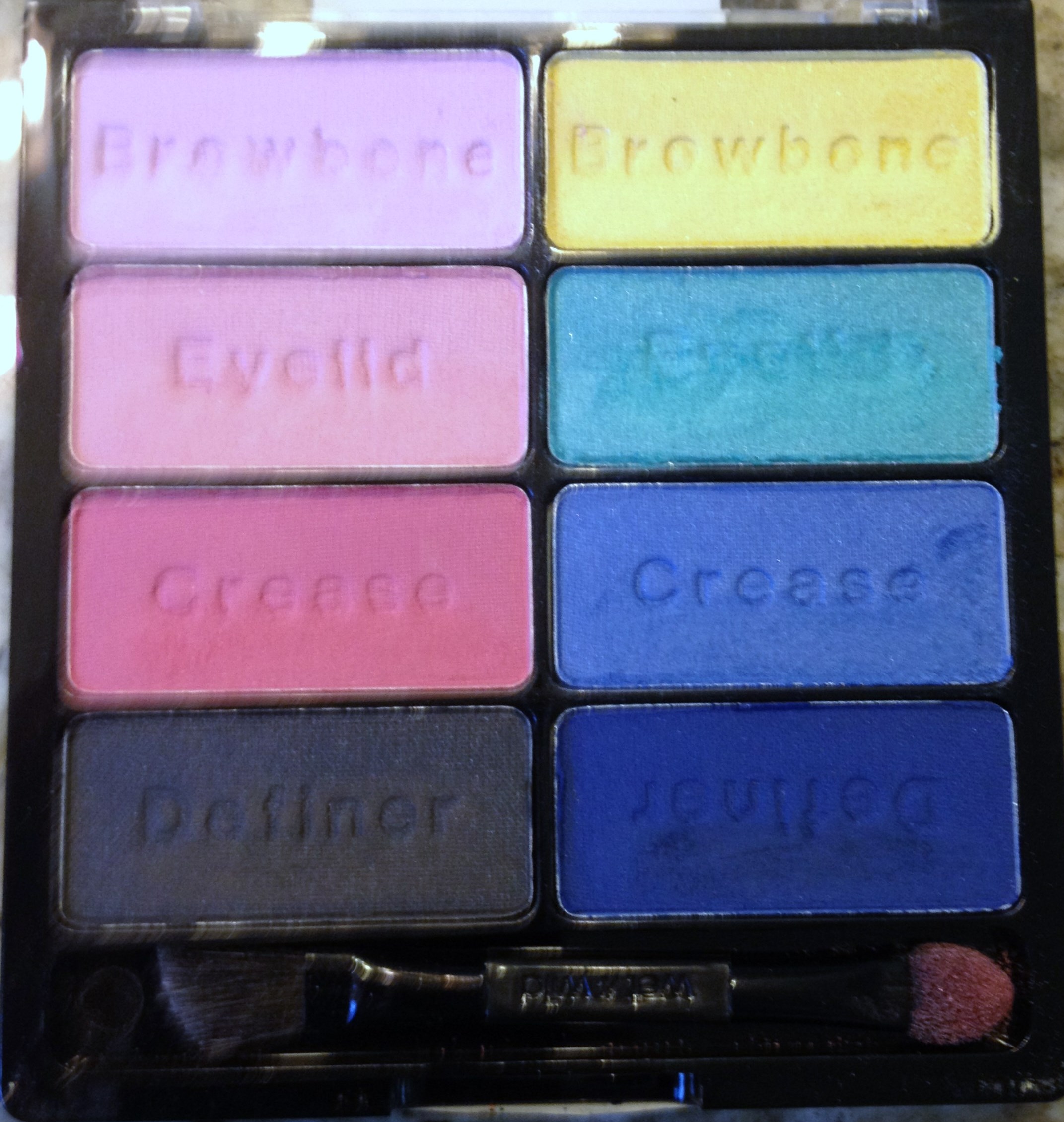
Up close and personal with the Poster Child palette
Obviously what caught my eye in the store was the bright colors. For some reason I also get annoyed when palettes try to tell me to use the most intriguing colors as a liner (even though I am in control of my makeup application so it’s a weird thing to be annoyed by), so I really liked that Wet n’ Wild used “definer” instead of “liner.”
The shades are extremely buildable and if you use a good primer on your lid, they will hold all day. Initially they go on more sheer and have a soft powder texture, but you can really pack on the color to great effect. The sponge-tip and brush duo applicator is decent for application, so if you’re not into brushes this can be a full service palette.
For the first look, I used the left half of the palette with the pink tones and the black definer.

One step closer to becoming a Pink Lady.
For most of these shades I had to dip back into the palette multiple times to get the pigmentation you see here in the swatches, but don’t let that scare you! Of the four, the deep coral color is easily the most pigmented, but the black could easily blend out for a smooth smokey eye.
I’m not going to lie, these shades were what drew me into the palette. I’ve been having a real moment where I am trying to channel my inner Rizzo from Grease. No idea where this impulse came from, but I’m going with it. This look is my homage to the Pink Ladies.
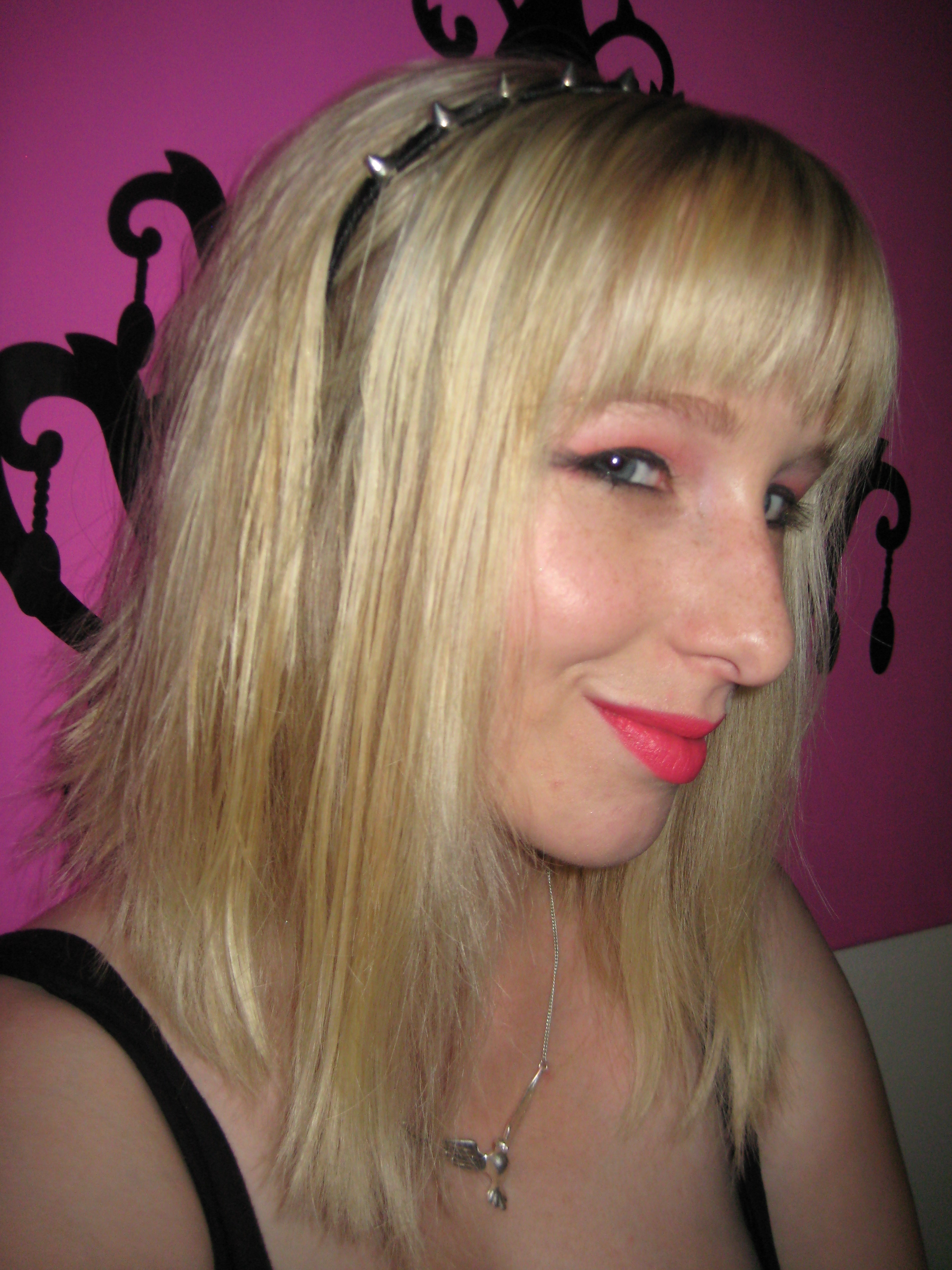
A metal spiked headband adds a bit of biker chic.
Pink with a touch of punk.
For this look, I followed the basic instructions imprinted into the shadows. I did a light wash of the shade that looks like a baby pink, bringing it up into the crease as well. Then I blended the deep coral into my crease. I really like the way the deep coral shade interacts with other colors. On top of the baby pink it looks more like a hot pink, though not as neon as my lip color.
Using the smokey black shade I created a faux tri-lash at the outer corner of my eye. I dusted the pearly pink along my brow bones and inner corners. While the rest of these colors are extremely versatile in regards to where you put them, the pearly shade is undeniably best suited as a brow highlight.
Other Necessities:
Urban Decay’s 24/7 Velvet Glide-On Eye Pencil in Black Velvet–such a deeply pigmented black liner. It really makes the look pop.
Revlon ColorBurst Matte Balm in Unapologetic–a beautiful, borderline neon pink matte shade. And the staying power is amazing. I have several products from this range and love them all.
♦♦♦
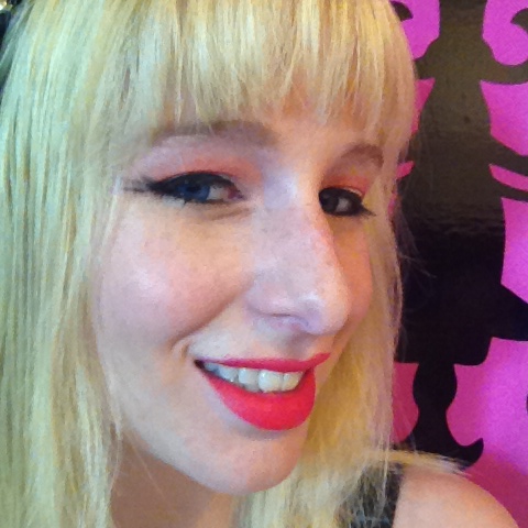
For the other look, I drew inspiration from Marvel’s X-Men. I am beyond ready for Days of Future Past to hit the screens, so to stave off the anxiety of waiting I created a look with the second half of the palette. The blue tones with yellow accent color instantly reminded me of the classic X-Men uniforms.
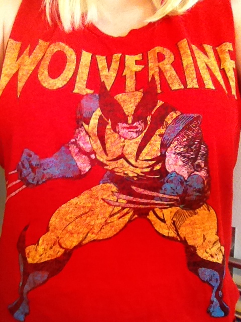
One of my favorite graphic cut-out tanks.
I believe I got this tank at Papaya last year. It’s such a great item for summer because the cut-out arms give you breezy freedom. I’ve been wearing it a lot recently as the heat picks up here in Southern California.

Beautiful, bright blues with a yellow accent.
You can really see the connection between the tank and the colors. Of all eight shades, the teal is the most pigmented in the palette. You really have to pack on the yellow to get to this golden sheen, but it’s worth the work. At first I was intimidated by these brights, but after creating this look, I cannot wait to play with them some more.

Epic superhero stare into the distance.

Easily the most extreme wing I’ve ever done.
Just like with the first look, I started with the second shade from the top, in this case the teal. I brushed the teal color all over my lid, up into the crease in a dome shape, which helped enhance the cartoon-like feel. Using a shader brush I gently blended the royal blue tone into the crease, maintaining the rounded dome. Using the deep blue shade I built a wing the reached mid temple. I had to pack this shade on to get the shape just right. Then I pulled the deep blue into the crease about three-quarters of the way in to the lid. There was a lot of trial and error for this wing, but I like the way it turned out.
To finish the look, I brushed the yellow/gold shade along the inner curve between my brow bone and the bridge of the nose. I also packed on the color under the lower lashes as a liner. I highly recommend using a liquid liner on your top lash line since liquid liners are so dramatic. I took the black liner to the tip of the wing to emphasize the length.
Other Necessities:
L’Oreal Telescopic Precision Waterproof Liner–this is the only liquid liner I own and it’s staying that way.
Maybelline Falsies Mascara in Blackest Black–at first I was skeptical about the promises of this product, but I’m now a believer.
Revlon Lip Butter in Candy Apple–a lovely, moisturizing, semi-sheer blue red balm.
Overall, I’m quite pleased with this palette. These two looks are just skimming the surface of what you could create with these eight shades. At just $4.99 from your local drugstore, the Poster Child palette from Wet n’ Wild is a must have for summer.

That palette is beaaauutiful!
LikeLike
I’m definitely a fan! There are two other new releases to the Color Icon line but they’re not as vivid.
LikeLike
Sooo pretty I need to go buy this now
LikeLike
I’d definitely recommend it!
LikeLike